personal work

Environment reconstruction + HDR projections by Xuan Prada

I've been working on the reconstruction of this fancy environment in Hackney Wick, East London.
The idea behind this exercise was recreating the environment in terms of shape and volume, and then project HDRIs on the geometry. Doing this we can get more accurate lighting contribution, occlusion, reflections and color bleeding. Much better environment interaction between 3D assets. Which basically means better integrations for our VFX shots.

I tried to make it as simple as possible, spending just a couple of hours on location.

  • The first thing I did was drawing some diagrams of the environment and using a laser measurer cover the whole place writing down all the information needed for later when working on the virtual reconstruction.
  • Then I did a quick map of the environment in Photoshop with all the relevant information. Just to keep all my annotations clean and tidy.
  • With drawings and annotations would have been good enough for this environment, just because it's quite simple. But in order to make it better I decided to scan the whole place. Lidar scanning is probably the best solution for this, but I decided to do it using photogrammetry. I know it takes more time but you will get textures at the same time. Not only texture placeholders, but true HDR textures that I can use later for projections.
  • I took around 500 images of the whole environment and ended up with a very dense point cloud. Just perfect for geometry reconstruction.
  • For the photogrammetry process I took around 500 shots. Every single one composed of 3 bracketed exposures, 3 stops apart. This will give me a good dynamic range for this particular environment.
  • Combined the 3 brackets to create rectilinear HDR images. Then exported them as both HDR and LDR. The exr HDRs will be used for texturing and the jpg LDR for photogrammetry purpose.
  • Also did a few equirectangular HDRIs with even higher dynamic ranger. Then I projected these in Mari using the environment projection feature. Once I completed the projections from different tripod positions, cover the remaining areas with the rectilinear HDRs.
  • These are the five different HDRI positions and some render tests.
  • The next step is to create a proxy version of the environment. Having the 3D scan this so simple to do, and the final geometry will be very accurate because it's based on photos of the real environment. You could also do a very high detail model but in this case the proxy version was good enough for what I needed.
  • Then, high resolution UV mapping is required to get good texture resolution. Every single one of my photos is 6000x4000 pixels. The idea is to project some of them (we don't need all of them) through the photogrammetry cameras. This means great texture resolution if the UVs are good. We could even create full 3D shots and the resolution would hold up.
  • After that, I imported in Mari a few cameras exported from Photoscan and the correspondent rectilinear HDR images. Applied same lens distortion to them and project them in Mari and/or Nuke through the cameras. Always keeping the dynamic range.
  • Finally exported all the UDIMs to Maya (around 70). All of them 16 bit images with the original dynamic range required for 3D lighting.
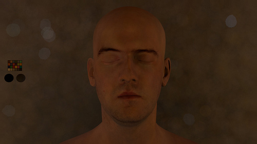
  • After mipmapped them I did some render tests in Arnold and everything worked as expected. I can play with the exposure and get great lighting information from the walls, floor and ceiling. Did a few render tests with this old character.
Cat's food - quick breakdown by Xuan Prada

The other I published a very simple image that I did just to test a few things. A couple of photographic techniques, my new Promote Control, procedural masks done in Substance Designer and other grading related stuff in Nuke. Just a few things that I wanted to try for a while.

This is a quick breakdown, as simple as the image itself.

  • The very first thing that I did was taking a few stills of the plate that I wanted to use as background to place my CG elements. From the very beginning I wanted to create an extremely simple image, something that I could finish in a few hours. With that in mind I wanted to create a very realistic image, and I'm not talking about lighting or rendering, I'm talking about the general feeling of being realistic. With bad framing, bad compositing, with total lack of lighting intention, with no cinematic components at all. The usual bad picture that everyone posts in social networks once in a while, without any narrative or visual value.
  • In order to create good and realistic CG compositions we need to gather a lot of information on-set. In this case everything is very simple. When you take pictures you can read the meta-data later in the computer. This will help to see the size of the sensor of your digital camera and the focal used to take the pictures. With this data we can replicate the 3D camera in Maya or any other 3D package.
  • It is also very important to get good color references. Just using a Macbeth Chart we can neutral grade the plate and everythign we want to re-create from scratch in CG.
  • The next step is to gather lighting information on-set. As you can imagine everything is so simple because this is a very tiny and simple image. There are not practical lights on-set just a couple of tiny bulbs on the ceiling. But they don't affect the subject so don't worry much about them. The main lighting source is the sun (although it was pretty much cloudy) coming through the big glass door on the right side of the image, out of camera. So we could say the lighting here is pretty much ambient light.
  • With only an equirectangular HDRI we can easily reproduce the lighting conditions on set. We won't need CG lights or anything like that.
  • This is possible because I'm using a very nice HDRI with a huge range. Linear ranges go up to 252.00000
  • I didn't eve care about cleaning up the HDRI map. I left the tripod back there and didin't fix some ghosting issues. These little issued didn't affect at all my CG elements.
  • It is very important to have lighting and color references inside the HDRI. If you pay attention you will see a Macbeth Chart and my akromatic lighting checkers placed in the same spot where the CG elements will be placed later.
  • Once the HDRI is finished, it is very importante to have color and lighting references in the shot context. I took some pictures with the macbeth chart and the akromatic lighting checkers framed in the shot.
  • Actually it is not exactly the same framing than the actual shot, but the placement of the checkers, the lighting source and the middle exposure remains the same.
  • For this simple image we don't need to make any tracking or rotospocing work. This is a single frame work and we have a 90 degree angle between the floor and the shelf. With that in mind plus the meta-data from the camera reproducing the 3D camera is extremely simple.
  • As you probably expected, modellin was very simple and basic.
  • With this basic models I also tried to keep texturing very simple. Just found a few references on internet nad tried to match them as close as I could. Only needed 3 texture channels (diffuse, specular and bump). Every single object has a 4k texture map with only 1 UDIM. Didn't need more than that.
  • As I said before, lighting wise I only needed an IBL setup, so simple and neat. Just an environment light with my HDRI  connected to it.
  • it is very important that your HDRI map and your plate share similar exposure so you can neutral grade them. Having same or similar exposure and Macbeth Charts in all your sequences is so simple to copy/paste gradings.
  • Akromatic lighting checkers would help a lot to place correctly all the reflections and regulate lighting intensity. They would help also to establish the penumbra area and the behaviour of the lighting decay.
  • Once the placement, intensity and grading ob the IBL are working fine, it is a good idea to render a "clay" version of the scene. This is a very smart way to check the behaviour of the shadows.
  • In this particular example they work very well. This is because of the huge range that I have in my HDRI. With clampled HDRI this wouldn't be working that good and you would probably have to recreate the shadows using CG lights.
  • The render was so quick. I don't know exactly but something around 4 or 5 minutes. Resolution 4000x3000
  • Tried to keep 3D compositing simple. Just one render pass with a few AOV's. Direct diffuse, indirect diffuse, direct specular, indirect specular, refraction and 3 IDs to individually play with some objects.
  • An this is it :)

Cat's food by Xuan Prada

Quick and dirty render that I did the other day.
Just testing my Promote Control for bracketing the exposures for the HDRI that I created for this image. Tried to do something very simple, to be achieved in just a few hours. Trying to keep realism, tiny details, bad framing and total lack of lighting intention.

Just wanted to create a very simple and realistic image, without any cinematic components. At the end, that's reality, isn't it?

Iron Man Mark 7 by Xuan Prada

Speed texturing & look-deving session for this fella.
It will be used for testing my IBLs and light-rigs.
Renders with different lighting conditions and backplates on their way.

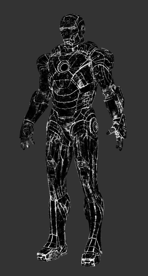
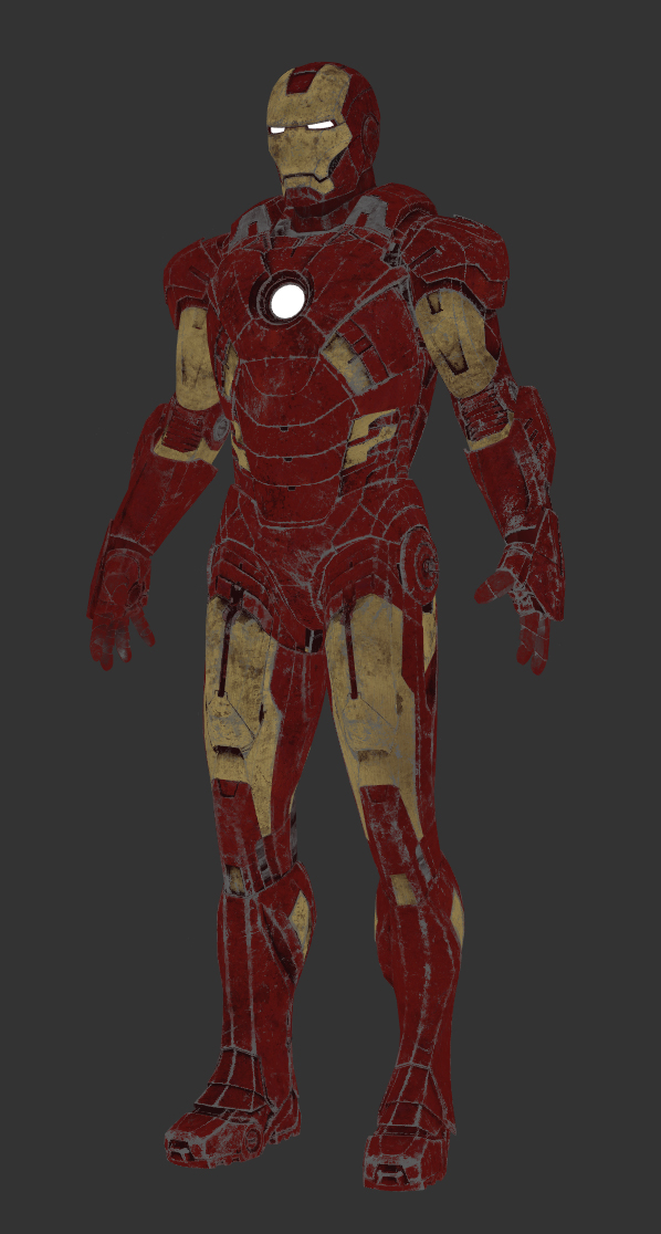
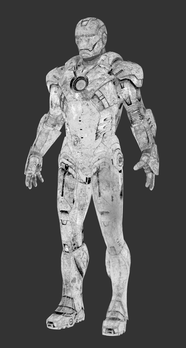
These are the texture channels that I painted for this suit. Tried to keep everything simple. Only 6 texture channels, 3 shaders and 10 UDIMs.

Color

Color

Specular

Specular

Mask 1

Mask 1

Color 2

Color 2

Roughness

Roughness

Fine displacement

Fine displacement

Skateboard screenshots by Xuan Prada

Just a few screenshots of my process working on the skateboard images that I posted  few days ago.

  • Jeans modelling in Zbrush.
  • Decimated model exported from Zbrush ready to be reconstructed in Modo.
  • Retopology process in Modo using the topology workspace.
  • UV mapping in Modo.
  • Final models in Modo.
  • Texture work in Mari.
  • Look-dev in Maya and Arnold.
  • Lighting blocking.
  • Final renders.

Lego by Xuan Prada

I continue with my transition to Modo. I already know more or less the basics of the software and I have adapted my way of working to be productive in Modo. It’s time to make my first image and put in practice all that I learnt last week.

I have chosen a simple theme. After watching The Lego Movie (and some great references that they used) I wanted to create something related with it. It’s simple enough to allow me to finish the image in half a day or so. Say hello to all my mates who worked on the movie, we worked together on Happy Feet while ago.

The model for the character is quite simple, perfect to try all the modeling tools that come with Modo. Great so far. The work plane is quite useful, love it.

Modo’s uv mapping tools are great and very fast. I love atlas projection and unwrap. I’ll be using them all the time. For this particular model I used only unwrap. Just select a few edgest and that’s it, done. I didn’t worry much about seams, I can fix that later in Mari.
I’m using only one UDIM, this model and textures are simple enough to use only un uv space.

I worked on the textures in Mari. I could have used Modo paint tools, but I’m used to paint in Mari, and it’s definitely faster and more powerful.

Only needed three texture channels. Color, Specular and Bump maps. I used two different bump maps, one with fine noise for the plastic, and another one with scratches and imperfections.
All the textures are 8k resolution sRGB and Scalar and 16bit .tiff

For the look-dev I created an Image Based Lighting rig. With an overcast HDRI, perfect to create atmospheric lighting without too much direct light coming from the sun. It gives me perfect reflections and nice contrast between light and shade.
Always working with a Linear Workflow.

Only used one single shader, with no layers. Simple shader with a bit of reflection driven by a specular map.

For the ground I used a simple grid sculpted in Zbrush. Just a few dunes and procedural noise to simulate sand.

I did a few tests to find the best way to setup Zbrush displacements in Modo.
I’ll be posting soon how to do it. It’s not that complicated :)

For lensing, I used a 50mm focal length camera. I created a low poly version of my characters and ground, just to block the camera angle and lighting.

Finally, I updated the proxy models with the final ones.
To lit the scene I used a nice high resolution panorama shot by myself. It gave me the perfect atmosphere and reflection for this shot. But I couldn’t get the perfect shadows.
I wanted to lit this like a miniature, so I wanted a very strong key light with a perfect and hard shadow. I just removed the sun from the HDRI and then added a 3D light just behind the characters.

I dind’t need to render aov’s or render passes, I just rendered a quick id matte to control the ground and the characters.

This is the final render.

And finally, the black and white image that I conceived from the very beginning.

Rembrandt lighting by Xuan Prada

…with a touch of salt&pepper.

Just a simple test here.
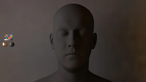
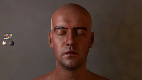
I wanted to create a strong portrait lighting for this male subject. I thought on Rembrandt Light, one of my favourite lighting set-up.
Rembrandt light is great, I love that kind of lighting specially when you are shooting portraits on exterior locations, but I prefer other lighting set-ups for studio shots.

So, I did a couple of touches to create a darkish environment on the Rembrandt lighting set-up for studio scenes and achieve a more strong and dramatic portrait.

Find below some test which I did and some lines about the construction of this set-up.
Big thanks to the guys of Infinite-Realities for provide this great model.

I used a big soft box created with a portal light controlled by Kelvin temperature.
Then, I created a huge sphere wrapping all the scene, with a 16bit grey to white gradient to help Final Gathering to add soft environment light.
I also create a strong rim light to separate a little bit the subject from the background.
And finally to create more penumbra areas and strong feeling to the image, I put a light blocker close to the subject. With this basic geometry with a constant black shader the environment light created by FG is absorbed on the right side of the picture.

With this simple set-up my Rembrandt Light looks more dramatic, right?

  • This is my scene. Quite simple.
  • Take a look to the orthographic views to see the distribution of the lights and other elements involved on this set-up.
  • Some parameters below.
  • Some lighting study before touch the computer.
Blocking.

Blocking.

Some environment lighting added.

Some environment lighting added.

Blocking the environment light using a black panel.

Blocking the environment light using a black panel.

Testing displacement maps.

Testing displacement maps.

First test with SSS.

First test with SSS.

Some passes to play with. (environment light).

Some passes to play with. (environment light).

Main soft box.

Main soft box.

Rim light.

Rim light.

Reflection.

Reflection.

Final render.